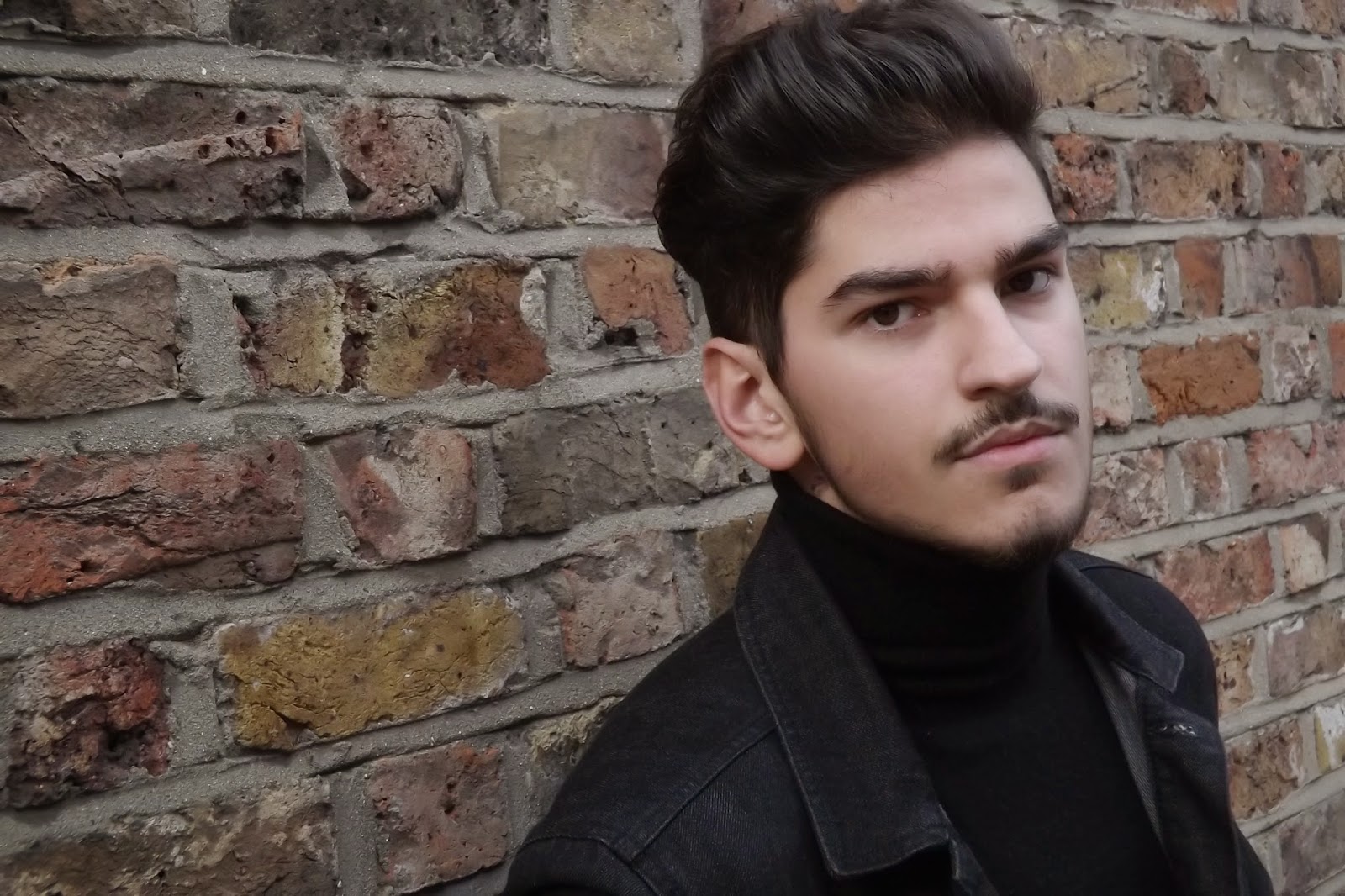
This is a possible image I would like to use for my front cover as it is really simplistic and the use of the brick wall behind the artist doesn't distract the audiences attention off the artist.
This is another image. I like this was because it is a clear close up of the artist, and you can really identify his serious facial expressions which would would be good to present.
This image pursues the conventions of the indie genre by the sort of rough look and white t-shirt.
Finally this image similar to James Blake's album cover, the blurred image can present a deep meaning of perhaps confusion or lost and ca convey that through the album cover if i chose to use this.


No comments:
Post a Comment